
global notifications
The Product
Bridge - Aimed to serve as a transitional product. An interim CRM intended to "bridge" the gap between NAF's outdated CRM (Bankerview) and NAF's new CRM (Cosmos).
The Team
Joshua Han (UX Researcher), Elise Munoz (UX/UI Designer), Kristen Falk (UX/UI Designer),
Laura Ramos (Sr. UX/UI Designer), Ryann Thomas (Product Manager)
User Persona
Inside Loan Officer (ILA)
Sprint Type
LEAN Sprint + Iterative User Testing (2 days)
the problem
Our internal loan officers encountered challenges in managing their email notifications within the current CRM, Bankerview. The platform was notorious for overwhelming users with irrelevant email notifications, leading to instances where important updates and events were overlooked.
In response to this issue, the Bridge product team was assigned the task of devising a solution. The objective was to enable loan officers to more effectively monitor their leads, prospects, and critical events, thereby optimizing their workflow for greater speed and efficiency.
the research
The team underwent qualitative analysis and brainstorming initiatives to gather the necessary preliminary data. Our research process went in the following order:
User Interviews
Affinity Mapping
Brainwriting + Heat Mapping
Problem Statements
User Interviews
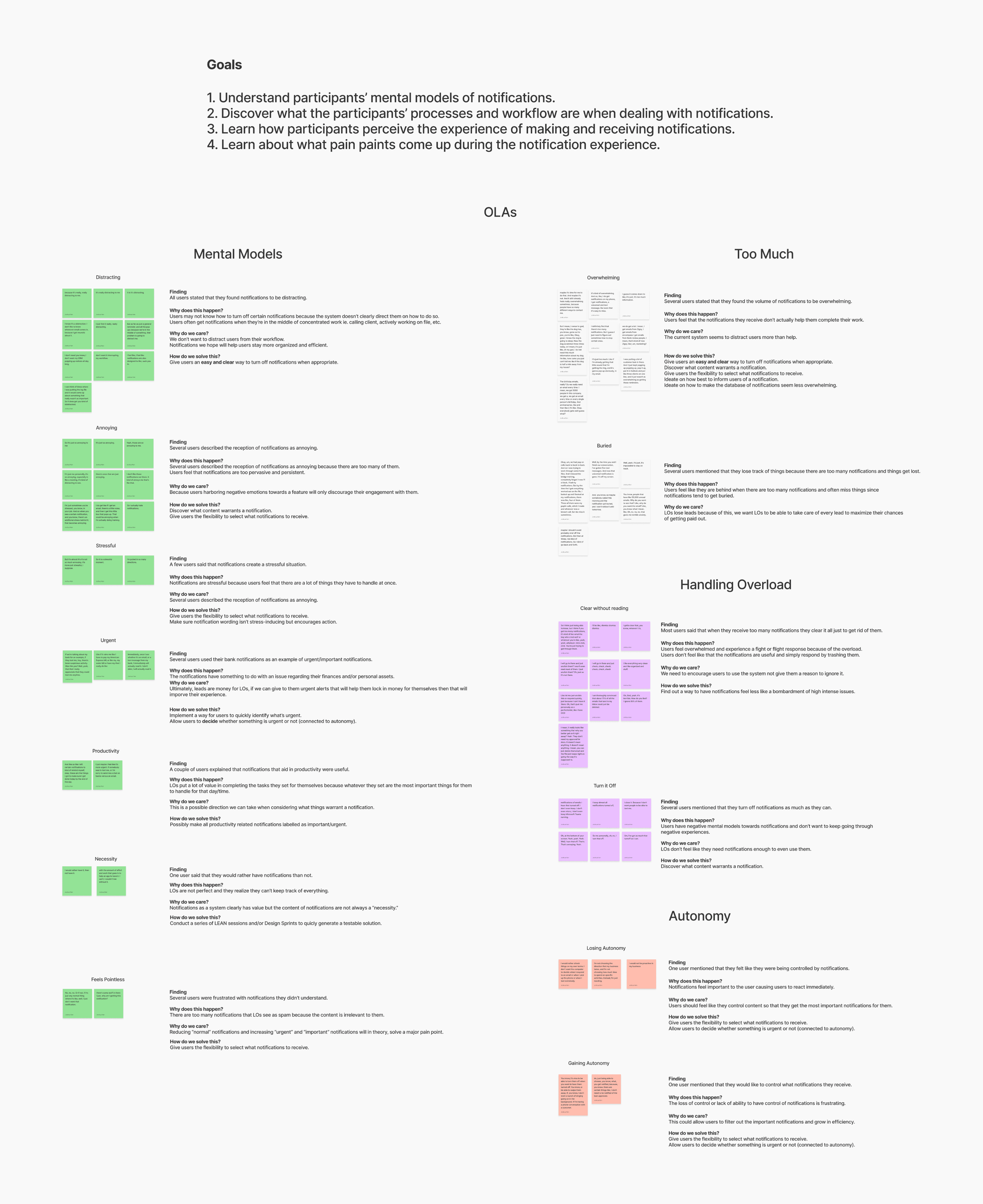
Joshua Han, our UX researcher extraordinaire, orchestrated a series of user interviews to delve into the nuanced landscape of notifications, with a particular focus on their impact on day-to-day work. A rotating cast of design team members played the role of diligent notetakers during these sessions.
Key findings from the interviews unveiled a spectrum of challenges:
Email notifications had a knack for arriving at the most inconvenient times, often disrupting client meetings.
The sheer volume of email notifications was staggering, with loan officers bracing themselves for an onslaught of 100 or more every morning.
The deluge of notifications contributed to a significant issue: the failure to identify critical leads and prospects, leading to potential client loss.
Given the frequent use of their phones, loan officers routinely activated their "do not disturb" mode, adding another layer of complexity to timely communications.
An average of 35 minutes per day was dedicated to the arduous task of tracking down essential emails.
In an attempt to manage the influx, many loan officers resorted to setting automatic rules on Outlook to redirect less important emails to spam folders. However, this strategy was not foolproof, as not all emails consistently landed in the intended folders.
Affinity Mapping
Next, research and design team members participated in a meticulous review of interview scripts and in a collaborative affinity mapping workshop. The objective was to distill patterns and themes from the interview data.
The identified themes at this juncture encompassed:
A unanimous sentiment emerged across all users: notifications were universally perceived as distracting.
A majority of users admitted to a tactic of mass clearance when overwhelmed with notifications, even if left unread.
Noteworthy instances of users regularly turning off notifications were observed.
A recurrent description from several users characterized notifications as annoying.
A subset of users expressed frustration with notifications that lacked clarity.
Some users conveyed a sense of being controlled by notifications, emphasizing a desire for personalized control over the types of notifications received.
A select few users articulated a heightened stress response triggered by notifications.
Conversely, a positive note was struck by a minority of users who recognized the utility of notifications in enhancing productivity.
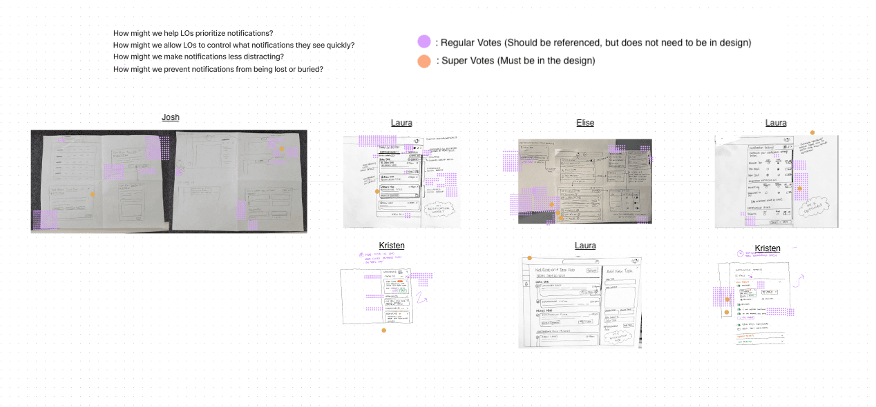
Brainwriting
In this phase, the team initiated the creation of "How Might We" (HMW) statements, strategically incorporating them into the brainwriting workshop to stimulate solution generation for our identified challenges. To foster a diverse range of perspectives, additional team members were actively included in this collaborative endeavor.
Following the culmination of the brainwriting activity, the team engaged in a voting process to discern the most favorably regarded solutions within each HMW column. This systematic approach aimed to distill and prioritize the most promising ideas for further exploration and implementation.

Conclusion
Following the culmination of our research initiatives, the team crafted problem statements to provide clear direction for our problem-solving efforts.
Problem Statements:
Loan officers require timely notifications of upcoming tasks to ensure they meet their commitments.
Loan officers must receive notifications of loan changes to facilitate the seamless progression of the loan process.
Loan officers need a notification system that prevents overwhelm, fostering motivation and satisfaction in addressing action items.
the sprint
Armed with a comprehensive understanding of the challenges at hand, the team embarked on a LEAN sprint to materialize a prototype ready for testing. Our sprint activities went in the following order:
Lightning Demo
Idea Sketching
Heat Mapping
Design Phase
Iterative Testing + Rapid Prototyping
the sprint: brainstorming
The team underwent qualitative analysis and brainstorming initiatives to gather the necessary preliminary data. Our research process went in the following order:
Lightning Demo
Leveraging the previously identified "How Might We" (HMW) statements as guiding principles, the entire Bridge team, comprising Project Management (PM), User Experience Research (UXR), and User Experience Design (UXD), participated in a Lightning Demo session. This collaborative "show and tell" involved rapid drawing of the presenter's general ideas, fostering a dynamic exchange of inspiration.

Idea Sketching
In the wake of the Lightning Demo, with a plethora of ideas and HMW statements fresh in mind, UXR and UXD initiated an idea sketching session to give tangible form to the burgeoning concepts.
Post-sketching, the team engaged in a heat mapping activity, casting votes for the ideas deemed most promising. This systematic approach aimed to distill and prioritize concepts for further development, ensuring alignment with the project's objectives.


the sprint: design phase
Design Phase
Transitioning from concept to creation, the UXD team took the helm, using the top-voted sketches as a blueprint for crafting the initial prototype slated for user testing. Meanwhile, UXR shifted focus to the crucial task of composing the usability interview script.
In the prototyping design session, the UXD team used the problem statements to collaboratively hone in on key user needs:
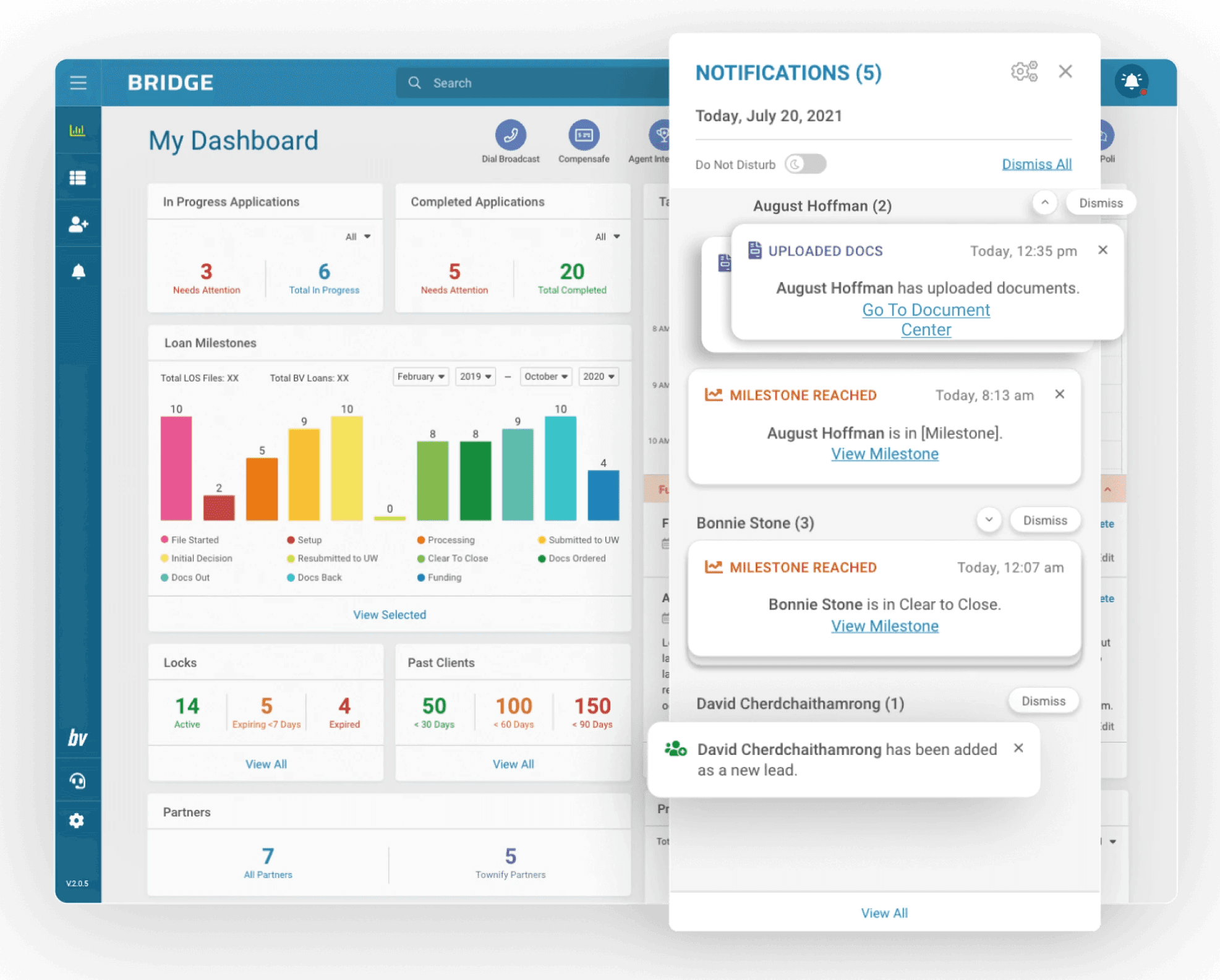
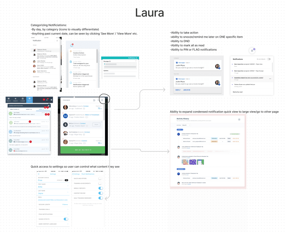
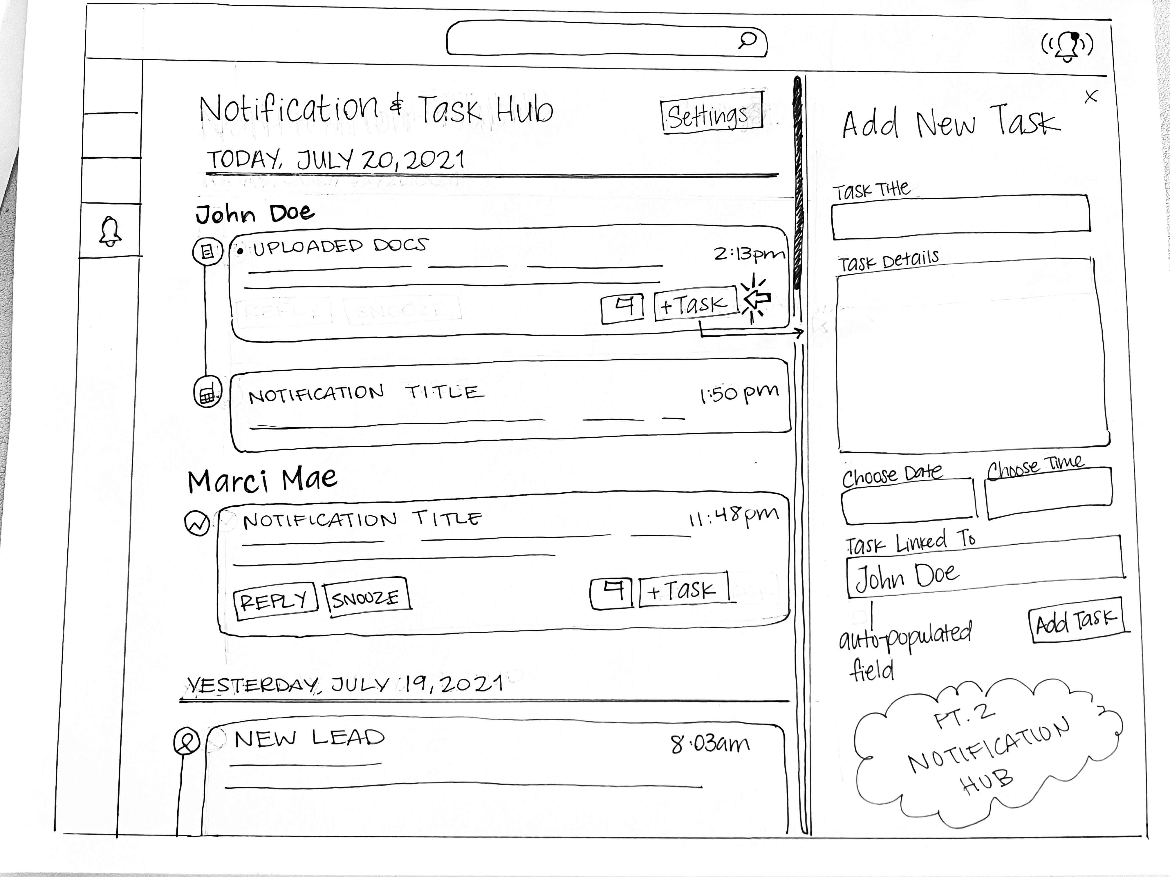
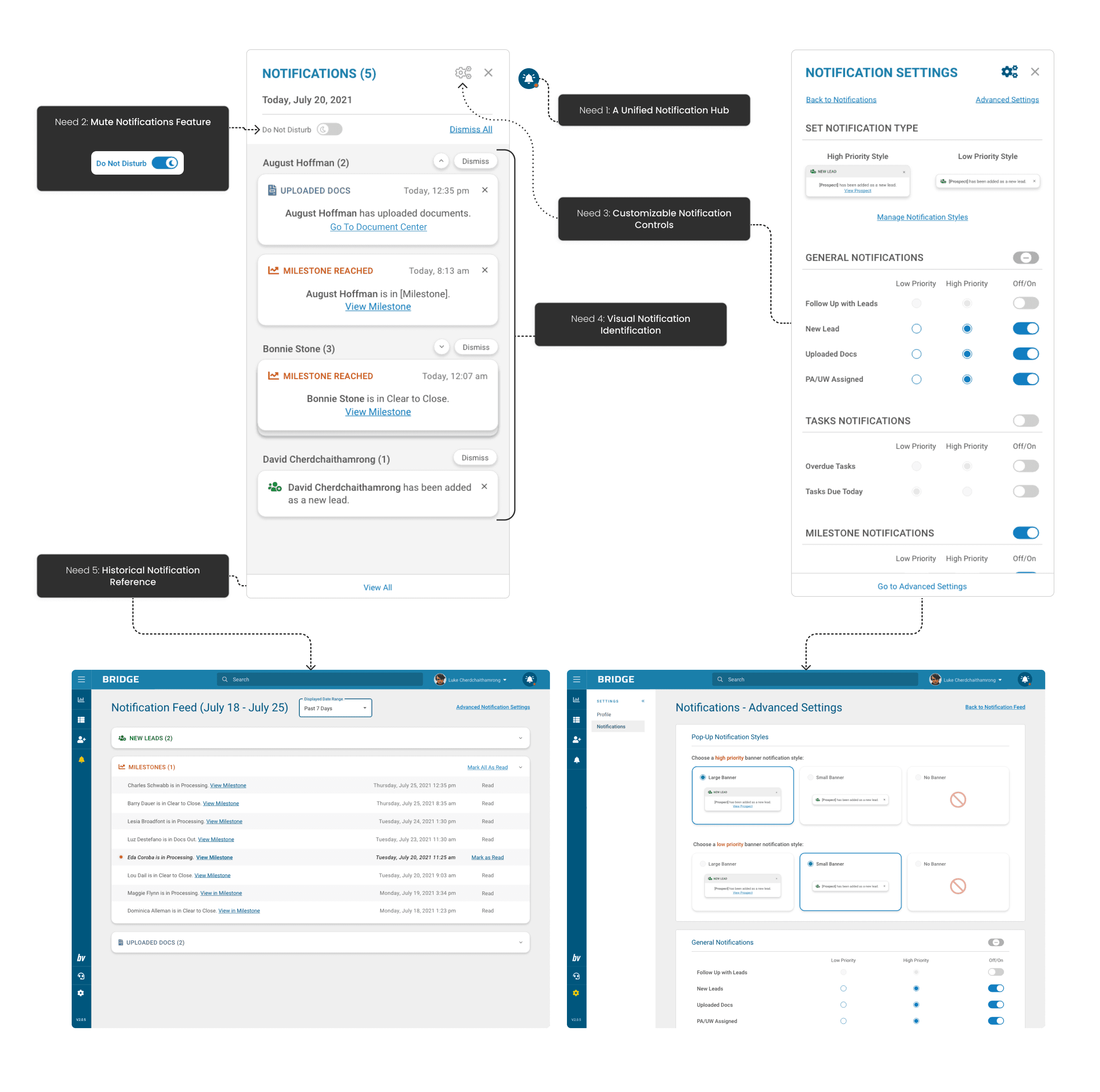
A Unified Notification Hub
Acknowledging the users' penchant for continuous multitasking and navigation across different application pages, we recognized the necessity for a notification hub easily accessible from any platform page. Consistent visibility of important notifications was deemed paramount to the user's workflow.
Mute Notifications Feature
Recognizing the need for focused attention during critical tasks such as client calls and document processing, the user should have the ability to mute in-site notifications selectively.
Customizable Notification Controls
Addressing user grievances regarding notification volume and content relevance, empowering users to customize notification preferences became a focal point, aiming to alleviate a common pain point.
Visual Notification Identification
Given the daily influx of email notifications spanning in various content types, the notification widget needed to visually distinguish content types compactly. The design aimed for simplicity to avoid cognitive overload while effectively conveying content type and perceived importance.
Historical Notification Reference
Users expressed a need to revisit old notifications for recalling specific details or safeguarding against overlooking critical client developments. The solution incorporated a quick and accessible reference to historical notifications.
We addressed these identified areas through the following solutions:
Insight into Design Decisions (Granular)
Overall Aesthetic:
Aligned with Bridge's design standards, our aesthetic choices aimed for a harmonious balance. High-contrast colors were strategically applied to draw attention to pertinent areas, while shades of gray were thoughtfully incorporated to provide a calming counterpoint. The primary objective was to create a user interface that, rather than overwhelming, fostered user focus on incoming notifications.
Need 1: A Unified Notification Hub
The notification widget trigger found its place within the site header, ensuring universal access across all platform pages.
The site's secondary color (dark blue) served as a background for the notification icon button, offering visual contrast without being overly conspicuous.
A red dot provided a quick visual cue for identifying new notifications.
Need 2: Mute Notifications Feature
A "Do Not Disturb" switch button was strategically placed within the notifications panel, with medium-contrast grays drawing subtle attention while allowing for easy dismissal.
The "on" mode of "Do Not Disturb" featured a bright blue color, intentionally designed to catch the user's eye and serve as a conscious reminder of the muted status.
Need 3: Customizable Notification Controls
Two distinct notification areas were established: "Notification Settings" and "Advanced Notification Settings," offering quick access and advanced options, respectively.
"Notification Settings" empowered users to manage their frequently used settings, including toggling specific notification types and designating "high" and "low" importance.
"Advanced Notification Settings" allowed users to visually configure the presentation of "high" and "low" importance notifications, acknowledging the diverse workflows and preferences of users.
Need 4: Visual Notification Identification
Clear visual markers were implemented for distinguishing notifications from leads and prospects.
A notification counter alongside lead/prospect names facilitated quick recognition of notification volumes, even in a collapsed view.
Visual representations of notification hierarchy were introduced, with high-importance notifications featuring a summarized sentence, actionable links, and date/time details, while low-importance notifications retained a smaller, summarized format.
Need 5: Historical Notification Reference
A dedicated page was crafted to archive past notifications beyond the current workday.
Users gained the flexibility to select the timeframe for viewing, addressing feedback received.
Notifications were categorized, minimizing cognitive load, and multiple entry points to the page were thoughtfully provided for user convenience.
Usability Testing and Iterative Improvements
Having crafted the interactive prototype, the next crucial step was subjecting our design to user testing. The team orchestrated five 30-minute usability tests, during which users navigated the prototype seamlessly. No discernible usability or accessibility issues were reported; users effortlessly located essential elements, and the test flowed smoothly. In line with the iterative nature of the sprint, the team actively refined the prototype based on user feedback, addressing minor points of confusion.
Iterative Updates
The following refinements were implemented during our usability testing sessions via rapid prototyping.
Categorization by Color
Initial Design: Employed a single shade of dark gray for all notification category types.
Update: Recognizing the need for quick visual distinction, the team introduced the use of color to categorize notification types.
Timeframe Selection for Past Notifications
Initial Design: Users were initially limited to viewing notifications from the "Past 7 Days."
Update: Responding to user feedback and uncertainty about the necessary timeframe, the team introduced the ability for users to select their preferred timeframe when reviewing past notifications. This feature was confirmed as essential by user input, ensuring a more tailored and user-friendly experience for loan officers.
Retrospective and Forward Planning
The team engaged in a retrospective session to assess the outcomes and chart the path ahead.
Despite the initial prototype sailing through testing with commendable success, the team acknowledged the necessity for deeper explorations and testing. Specific areas requiring additional scrutiny included notification content types, the functionality of the Do Not Disturb feature, and various technical intricacies.
While considering the global notification feature initiative a promising kickoff, the decision was reached to temporarily shelve it. This strategic move enabled the team to redirect their efforts toward addressing more immediate and critical feature implementations, ensuring a prioritized and comprehensive approach to enhancing the overall user experience.
